Small Business Logo Design: The Ultimate Step-by-Step Guide
Key takeaways
- Your business description does more design work than your name. Industry, audience, and story all live inside it, so the more specific it is, the sharper the logo on the other end.
- Spelling and case both get chosen on purpose. Country-specific spelling and letter case shift how established a brand reads, and nearly half of Fortune 500 logos land on all caps for exactly that reason.
- Every logo fits one of six categories: wordmark, monogram, crest, mascot, icon, or abstract symbol, and picking the right one shapes how a brand feels more than any other single decision.
- Color comes down to color-wheel math more than instinct. About 44 shades cover the primary color of the world's top 800 brands, so start inside that zone and build out with analogous, complementary, or tonal pairings.
- Typography carries emotion before anyone reads a word: bold letters read as strength, italics read as motion, rounded letters read as warmth.
- A logo has to survive tiny and survive flat. Every design gets shrunk to favicon size and kept to solid color before it's finished, since gradients rarely survive a t-shirt or an embroidery machine.
What Actually Goes Into Professional Logo Design
(and why it's more than picking a font)
When Jen's Flowers or Mother Earth Landscaping takes the leap into starting a business, one of the first real decisions on the list is the logo, and the brand sitting behind it. Most people walk into that first conversation expecting to pick a font, choose a color, and be done by lunch.
What actually happens, when it's done right, is closer to a small research project. A logo that holds up runs through a fairly long list of deliberate checks. Skip one, and it ends up looking like a clipart placeholder nobody got around to replacing. Get them right, and it looks like it belongs to a real, established business.
That gap matters more for a small business than almost anyone else. A big company can absorb a mediocre logo. It's got a marketing department, an ad budget, and years of name recognition doing the heavy lifting. A local business just starting up has none of that cushion.
For Elegant Catering, just getting off the ground, the logo is the first impression. It's on the tasting menu, the van, the invoice, and the corner of every photo on the website. It has to do a lot of work with almost no room for error.
Logo design, done properly, is a series of sequential decisions, each one backed by a reason and the decisions made before it. Here's the full path a good designer walks (and the order matters), from the moment a business settles on its name to the moment the mark is ready to use.
Step 1: Understanding the Name and the Business Behind it
Before any graphic designer spends any creative energy, the first step is to look closely at the business name and the description behind it: the industry it resides in, and who it serves.
That description is where the real value hides. "We sell flowers" gives a designer almost nothing to work with.
Compare that to: "Jen's Flowers hand-arranges seasonal bouquets and wedding florals for the Riverside neighborhood." That's full of signal. Industry (floral arrangement, with a wedding and events angle). Physical objects that matter to the brand (flowers, bouquets, arrangements). Emotional tone (personal, warm, welcoming). Even a sense of place. Every detail narrows the design space.
That's why a real description does more work than a one-liner ever could. The more specific it is, the more a designer (human or AI) has to work with, and the better the reasoning about which visual direction actually fits.
Different industries lean toward different design conventions for good reasons. A landscaping company and a law firm shouldn't look like they came from the same template, because their customers want completely different things. Someone hiring Mother Earth Landscaping wants to feel warmth and a connection to the natural world. Someone hiring Zucker & Smith Accident Lawyers wants to feel stability and competence.
A rich description is what separates those two, instead of both landing on something generic that fits nobody.
Step 2: Spelling and Case - Where There is No Room for Error
A logo is one of the most permanent things a small business will ever produce. It ends up on signage, business cards, invoices, embroidered polos, vehicle wraps, the website header. Often for a decade or more.
Everyone already knows the stakes of a spelling mistake (just ask the guy with the "No Regerts" tattoo). What fewer people think about is spelling for a specific country. "Optimised Installations" reads as completely normal in the UK. In the US, "Optimized" is the only version that looks right, and the "s" spelling just looks like a typo. Sometimes the swap runs the other way on purpose: a US company calling itself "Harbour Estates" instead of "Harbor Estates" to borrow a little British polish. Either way, it's a decision, not an accident, and it gets locked in before the logo goes anywhere near a printer.
Case matters almost as much as spelling, and it's a decision most people never make consciously. All caps is the single most common style among Fortune 500 logos, used by about 47% of them, well ahead of title case at 33% (Source: 60+ Logo Stats and Facts). All caps reads as bold and corporate, exactly the impression a big, established company wants.
Small businesses are usually better served by title case, where only the first letter of each significant word is capped. It feels warmer and more human, which fits a business that lives and dies on local relationships and word of mouth.
There's nuance here too. It comes back to what the business wants to convey. Elegant Catering benefits from a softer, title-case read that feels refined and personal. An industrial or rugged startup like Back Country Rapids might genuinely be better off in all caps.
Case is a real design lever with a real effect on how people read a brand. It gets chosen on purpose, not left as whatever the owner happened to type into a form.
Step 3: Choosing a Category that Fits the Business
Every logo falls into one of six broad categories. There are no hard rules here. Nothing stops a plumber from using an abstract symbol or a tech company from using a mascot.
Some fits are just far more natural than others, though, and choosing the right category is one of the most personalizing decisions in the whole process. It shapes how a brand feels more than almost anything else does. Here are the six, with a famous example of each.
The Stylized Wordmark
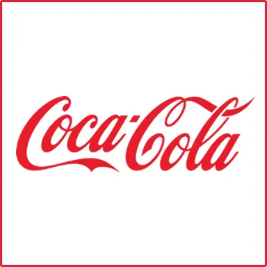 A stylized wordmark turns the business name into the logo, usually through custom lettering or a carefully chosen typeface. No separate icon, no symbol. The way the name is drawn does all the work.
Coca-Cola is the textbook example. That flowing script is the brand. You can spot it from a fragment, in a language you don't read, in a color that isn't even red.
Wordmarks shine when the name is short and easy on the eye. If the name is the story, let the name be the star instead of hiding it behind a symbol. That's why a business like Jen's Flowers so often lands on a wordmark. The name is personal, it's easy to say and remember, and it already carries warmth. The smartest move is usually to render that name beautifully instead of inventing an icon that competes with it for attention.
A Monogram (your Business Name's Initials)
 A monogram reduces the name to its initials. Right call when the business name is long, when it's a mouthful, or when the brand's already known enough that the initials carry meaning on their own.
IBM is the classic case. Almost nobody thinks "International Business Machines" anymore. Three letters became the entire identity, and spelling out the full name would feel almost quaint.
Monograms suit longer or more formal names, and they get more powerful as a brand builds recognition. The trade-off: a monogram asks people to already know, or learn, what the letters stand for. That's a tough starting point for someone just launching. Nobody knows what the initials stand for yet. It's a better fit once a business has a few years of recognition behind it than for one that needs to explain itself at a glance on day one.
The Crest
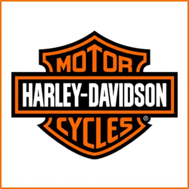 A crest borrows the visual language of heraldry: shields, banners, symmetry, often a founding date or a short motto. It's an old form, and that's the point.
Harley-Davidson uses the crest format to full effect. It works because the shape signals heritage and permanence before you've read a single word inside it.
A crest fits a business that wants to feel established and built to last, and here's the fun part: that impression is available even to a brand-new company. It lends borrowed gravity. A barbershop, a brewery, a coffee roaster, a family trade, any of them can use a crest to say "we take this seriously and we're here to stay." That's a valuable message when you're trying to earn a community's trust.
The Mascot
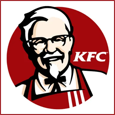 A mascot puts a character front and center. It gives the business a face and a story.
Colonel Sanders for KFC is one of the most recognizable mascots in the world. He turned what could've been a faceless fried chicken chain into something with warmth and a sense of someone actually standing behind the food.
Mascots work well for businesses that want to feel fun, friendly, or family-oriented. They're memorable in a way abstract shapes rarely are, because people connect to faces instinctively. The catch: a mascot has more personality to get right, and more detail to reproduce, so it needs to survive the small-size test (more on that below).
The Industry Icon
 Every dentist ever. An industry icon uses a recognizable object straight from the trade: a wrench for a mechanic, a rolling pin for a bakery, a leaf for a landscaper. It communicates instantly, even to someone who's never heard of the business, because the icon does the explaining for you. A wrench says "repairs happen here" without a word.
This is often the right call for trades and service businesses, where clarity beats novelty and a customer scanning a busy street (or a crowded search page) needs to understand what you do in half a second, especially when nobody's heard of the business yet. For a business like Mother Earth Landscaping, a clean, well-drawn leaf can say "growing things, cared for" better than any tagline. Just keep it simple and distinctive, or it blurs into the thousands of other wrenches and leaves already out there.
The Abstract Symbol
 An abstract symbol is a shape with no literal meaning until the brand builds one into it. Nike's swoosh is the famous case. On its own it's just a curved checkmark, meaning nothing at all. Decades of consistent use poured meaning into it until it became one of the most valuable marks on earth.
Abstract symbols are flexible and endlessly scalable. They never lock a company into one product or trade the way a literal icon can. The trade-off is patience. There's no built-in association to lean on, so an abstract mark takes longer to click with an audience and relies on repetition to earn its meaning. For someone just starting out with zero name recognition, that's a real cost. This mark works best for a business that can afford to be patient, not one that needs to be understood the second someone sees it.
Step 4: Color - Chosen with More Math than You'd Expect
Most logos use one or two colors, not counting black or white. That restraint isn't an accident. The numbers behind it might surprise you.
In preparation for writing this guide, I actually sampled the colors of the world's top 800 brands (and that's a weekend I'll never get back). By sampling the primary color (the one that made up more than half the total ink used), only 44 distinct colors showed up across all 800! The biggest, most successful brands keep converging on the same narrow band. Not just the same hues but the same specific combinations of darkness, brightness, and saturation. They avoid colors that read as muddy, sickly, or neon, and cluster inside a surprisingly small "known good" zone.
Once you've got a strong primary color, the secondary and complementary colors come down to color-wheel math, not guesswork. That's one of the most reassuring parts of the process for an owner who doesn't think of themselves as visual.
Three reliable moves here:
- The Sidekick (color neighbors on the color wheel)
A color neighbor is an analogous color sitting right beside the primary. Neighbors create a calm, cohesive palette because they're already related, which suits gentler, more organic brands. Mother Earth Landscaping is well served by a family of nearby greens and warm earth tones that feel of a set. - The Arch Nemesis (a color opposite)
This complementary color sits directly across the color wheel from the primary. Opposites create maximum contrast and energy. Makes a logo pop on a shelf or a screen. Right choice for a brand that wants to feel bold and grab attention. - The Alter Ego (same color, different shade)
This option is to not add a second color at all! Vary the lightness of a single hue using tints and shades to create depth. Keeps the palette disciplined while still giving the design room to breathe.
Whichever move you make, the principle's the same. Start from a color in the known-good zone. Avoid the small set of shades that consistently test as ugly. Apply one of these three relationships. The combination lands as a winner more often than not.
Step 5: Letting the Typography Carry Emotion
Fonts communicate feeling before anyone consciously reads a single letter. That pre-verbal impression is one of the most powerful tools in a logo. The shape of the letterforms sets the emotional tone on its own.
Thick, blocky, heavy letters suggest strength and durability. That's why they show up so consistently on gyms and fitness brands, where a local gym wants to feel like a place that means business.
Italicized, slanted type suggests motion and forward momentum. Natural fit for a running store or anything built around performance. The letters themselves look like they're leaning into a sprint.
Rounded, bubbly, slightly cartoonish letters suggest warmth and playfulness, which is why daycares almost everywhere reach for them. Those friendly, cushioned shapes tell an anxious parent, without a word, that this is a gentle place.
Matching the letterforms to the emotional core of a business matters just as much as matching the color. A daycare in stark, heavy industrial type would feel unsettling. A hardcore gym in soft bubbly letters would feel unserious. Nobody could explain why, but they'd feel it. Typography is emotion. The right choice matches the feeling the business wants to leave people with.
Step 6: Making Sure it Still works Tiny
A logo rarely gets to live at the comfortable size it was designed at. In the real world, it spends most of its life small: a favicon in a browser tab, an app icon on a phone, a circular avatar on social media, a tiny watermark in the corner of a photo.
So every design goes through a size test: shrink it down and confirm it still reads clearly before calling it finished.
This step catches problems invisible at full size. Fine details and delicate flourishes that look gorgeous on a storefront sign can smear together or vanish at favicon size. A mascot's expressive face can turn into an unreadable smudge. A crest packed with tiny text can become a gray blob.
If a logo only works big, it doesn't really work, because so much of its life gets lived small. The answer is often a simplified "logo mark," a stripped-down version that holds up at the tiniest sizes while the fuller version handles the bigger applications.
One more practical constraint: it's why good logo design usually steers away from gradients, even though a smooth blend of colors can look genuinely beautiful on a screen.
The trouble starts the moment a business wants physical merchandise. Shirts, hats, embroidered patches, printed signage, promotional swag: gradients get difficult and expensive fast, because a lot of printers, and especially embroiderers, can't reproduce a smooth color transition. Thread doesn't fade. Ink on certain processes doesn't blend.
A clean, flat color choice travels far more reliably from the screen into the real world where a small business actually lives. Flat color wins out from the start, over something that looks gorgeous in a mockup and falls apart on a t-shirt.
Putting it All Together
None of these steps is complicated on its own. What makes the difference is doing all of them, in order, for every single logo, instead of skipping straight to picking a font and a color and hoping for the best.
Read the name and description closely enough to actually understand the business. Protect the spelling and choose the case on purpose. Pick a category that fits the brand's personality, not whatever's easiest. Choose color from the small set of shades the best brands keep returning to, then build the palette with simple color-wheel math. Let the typography carry the right emotion. Confirm the whole thing holds up at the size of a thumbnail, and that it survives the trip onto a printed shirt.
That's the difference between a logo that looks fine today and one that still looks right on a storefront, an invoice, and an embroidered polo ten years from now. For Jen's Flowers, Elegant Catering, and Mother Earth Landscaping alike, the goal's the same: a mark built with intention at every step, so it can carry the business confidently for a long time.
And hey, if you're looking to design a logo, Herosite just happens to offer that. From three to eighteen options; usually in under ten minutes. Free to try.